I am very excited to announce that version 3 of Parseur application is now in preview, awaiting your feedback! While this new version doesn't bring ground-breaking new features, it should make using Parseur more intuitive and enjoyable, while preparing for our future developments.
In the rest of this article, I will detail what has changed and why. If you'd just like to try out the new design, you can skip the read and click on the button below.
What is Parseur app?
Parseur has several components:
- The main site (that includes the page you're on right now)
- The API (the computer interface to Parseur)
- The app (the user interface to Parseur)
Parseur v3 is a redesign of Parseur app, where most of our users spend their time. The app must do two things very well:
- Onboard new users quickly and painlessly. Parseur can perform many document processing tasks, but you won't need to know everything on your first try. Parseur app should painlessly guide you through the basics and hide the rest.
- Make power users work efficiently. Once you get a grasp of the main features, you may want to deep dive and tune your document extraction pipeline to your requirements. As you get hooked to Parseur like some of our happy customers are, Parseur app should not get in the way and not require you click or scroll hundreds of times to get what you need.
Balancing the needs of new users and power users is a challenge faced by many SaaS and software companies. We hope this new version does a better job at it.
Why a redesign of Parseur app?
First, a disclaimer: I am not a designer, nor a world-wide expert in anything UI (user interface) or UX (user experience). Parseur is a small 3-people company I co-founded. My day-to-day involves working on our front-end React application but also sales, marketing, customer support, admin and everything in between.
When it comes to design, my go-to approach is that it has to look good, feel good, work well and take as little time as possible to implement and maintain.
Now, let me tell you the story of the Parseur app.
For the very first months of development, Parseur was green, had pirates (yes) and used Google's Material Design. You can learn more about that forgotten glorious age in this interview about Parseur beginnings on Starter Story.
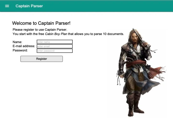
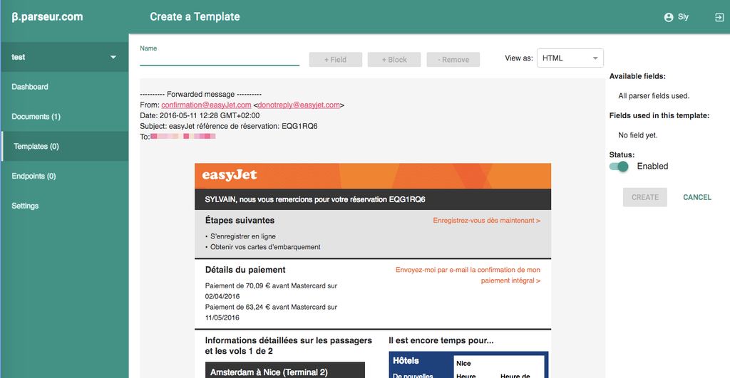
By the end of 2016, we were ready to launch to the world wide web, but had sadly ditched the pirates and swapped Material Design for Twitter's Bootstrap design. The reason why we ditched the pirates is we chickened out releasing an enterprise-ready B2B SaaS themed with planks, hooks and bottles of rum (maybe it's our loss, we will never know). The reason why I preferred Bootstrap design was that, back in 2016, Material Design and React were still young and, Material UI (the React port of Material Design) lacked some components and polish that made any customization complex and code-intensive. Bootstrap was more mature and easy to work with. At least at first.
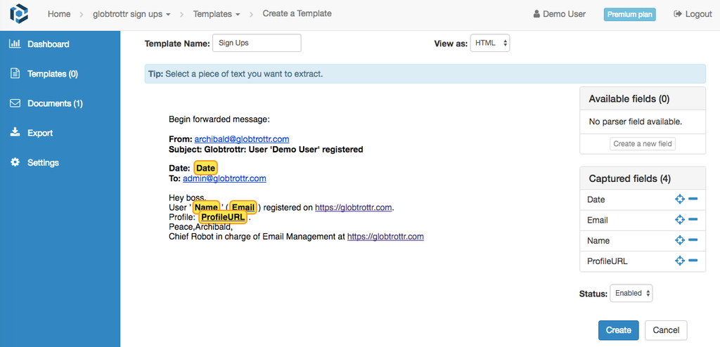
As time went by, Parseur grew in size and scope. We added features, tweaked some knobs here and some whistles there, fixed some bugs. New features meant new pages to design, new navigation, new forms, new checkboxes or new dropdown. And it also meant tailoring Bootstrap framework more and more to get what we wanted. As easy as it was to get started quickly with Bootstrap, it proved harder and harder to tweak to our needs and slowed us down.
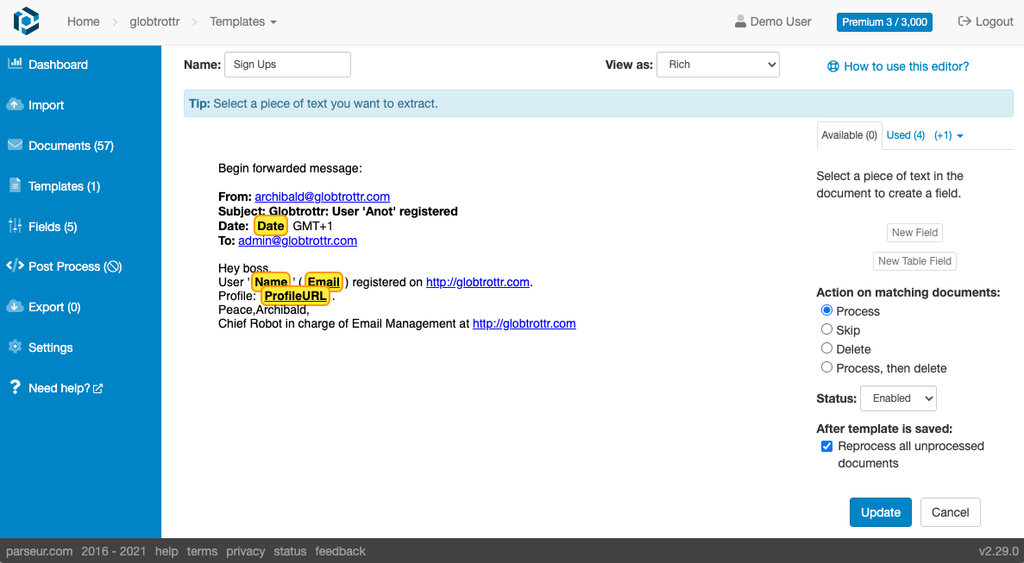
As we were planning for the next big feature upgrade of Parseur, I decided I wanted to start with a clean state and use the opportunity to upgrade our design. Goals for the new design were to both offer a better experience to our users while making it easier for us to tailor and fine-tune to our requirements.
We decided to leave good old Bootstrap framework behind in favor of Tailwind CSS. As a utility-first framework, Tailwind is a lower-level library that doesn't make assumptions on what a button or a form input should look like. You are free to make it look exactly how you want it to be. Although it means more work upfront, we were helped by Tailwind UI for inspiration and guidance.
Work started early July 2021 and took about two months to complete. I found that the best way for me to manage this project while taking care of other responsibilities was to do all the chores (support, meetings, emails, admin) in the morning in order to have the rest of the day free to focus on upgrading the UI. It helped that July/August is usually quieter in terms of support at Parseur and that, being winter down here in Mauritius, there was less incentives to take a plunge in the pool or go to the beach 😊.
So, what's new?
What's new in Parseur v3?
New design
Our old app started to look dated. It had that "Bootstrap" look like many other websites out there.
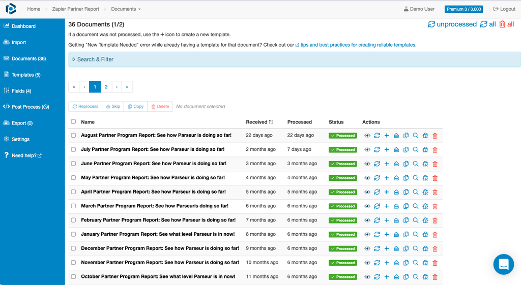
We went for a more modern look. We kept our "Parseur blue" color as our primary color, but with more pastel colors and a bolder typography.
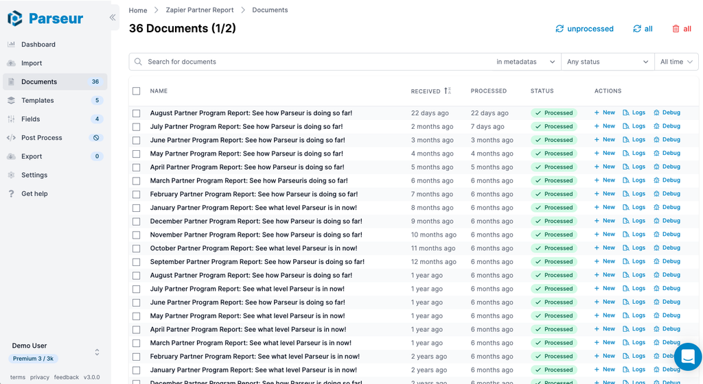
We also made some other changes such as more consistent headings across pages, more consistent forms and a better experience on mobile.
Improved navigation
The old app had a top header, a left menu when in a mailbox or in your account settings and a footer.
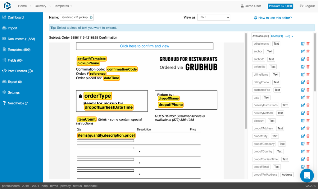
The new app only has a left menu, leaving more space for the main content. The new menu is also collapsible, giving you even more room, especially useful when working on complex templates.
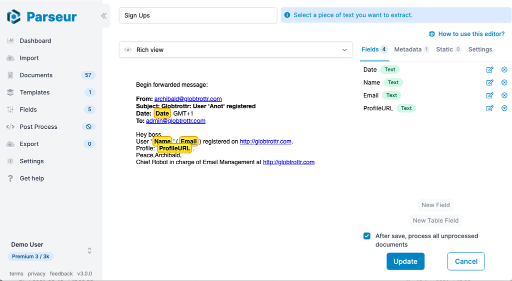
Improved template editor
The template editor is both the most complex page of the application and where you are likely to spend most of your time if you are managing templates by yourself. As we added features to the editor over the years, it grew more complex than it could be.
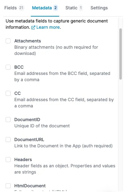
Better tabs

We reworked the tabs to make them less messy:
- Old "Available" and "Used" tabs were merged into the "Fields" tab resulting in less context switching while creating fields.
- Static fields are always shown. Static fields were previously hidden under the small triangle icon on small screens, making them less discoverable and leading to questions on our support chat.
- New Settings tab: this tab now includes lesser-used options, like template actions and disabling a template.
- Action buttons are always shown: buttons such as "New Field", "New Table Field" or "Create template" are now fixed at the bottom of the screen and always available. In the old version, you had to scroll and scroll to reach them if you had many fields in your mailbox.
"Extra" fields renamed "Metadata" fields
Extra was a poor naming choice from us. Several users had suggested renaming them over the years. The new tab also displays the description of each field.
Confirmation dialog when leaving the editor
You will now be prompted when trying to leave the template editor while having unsaved changes. No more loosing your in-progress work when mistakenly clicking outside of the template editor.

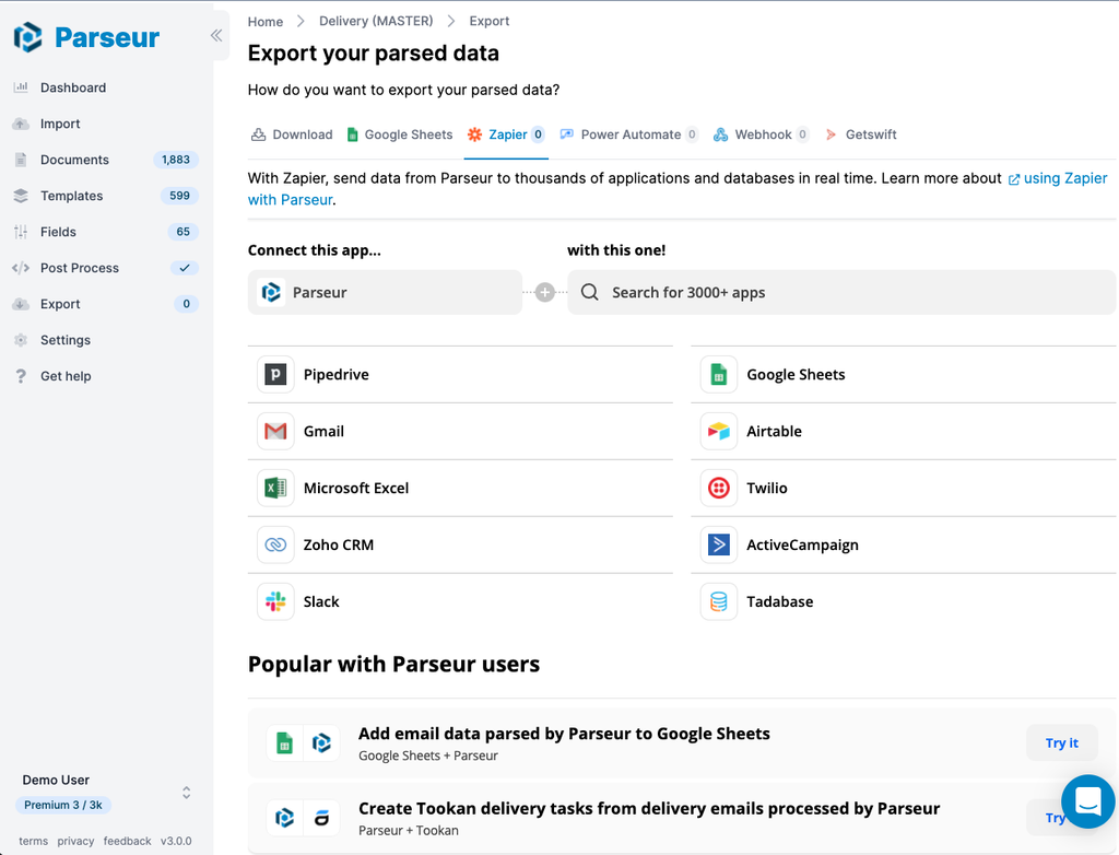
Updated Zapier integration page
The old Zapier export screen was custom-made and relied on Zapier API.
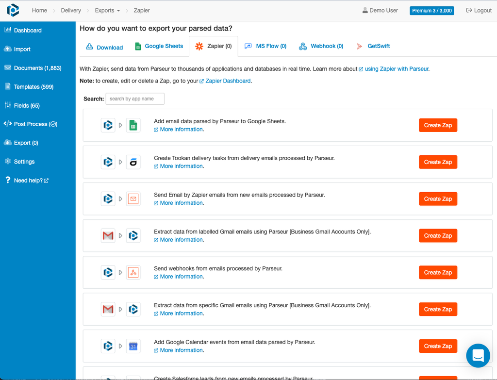
While we were working on the new design, Zapier released an embeddable application directory that looks way better than ours did, has better search capability and integrates nicely with our new design!
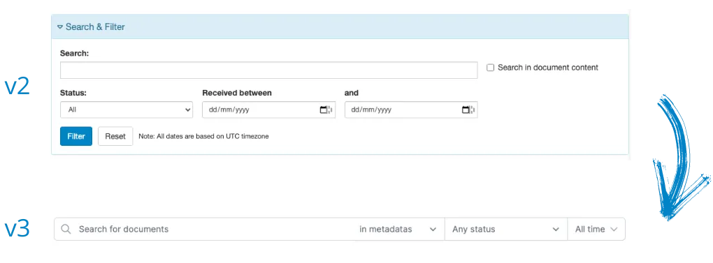
Improved search and filter
We reworked search and filter forms to take less estate on the page and update the search results as you type. The document date range filter was also improved, now offering predefined ranges (today, yesterday, last 7 days, last 30 days).
Contextual bulk actions
When on the Document list page, less-used actions (like reprocess, copy, skip and delete) now only appear when you select the document using the multi-select checkbox. This simplifies the individual action list and allows to display the action description on top of the icon.

Other changes
Other small changes include:
- A new page loading progress indicator at the top of the page
- Pages reworked for clarity. On each page we tried to remove as much as much as we could while keeping all features
- Refreshed icons for some elements like templates, documents, downloads and account
- Improved performances: app should should feel faster to start and use
- And much more, come try the new design!
What's next?
We will have version 3 available in preview for a few weeks in order to gather feedback and make sure everything is still working good for everybody. During that time the v2 will still be available as the default version. Once we are confident v3 works perfectly, we'll retire Parseur app v2 and make v3 the default.
Last updated on
